Inperium connects businesses and nonprofits to its resource-rich partner network, enabling them to share services and resources that help them grow.
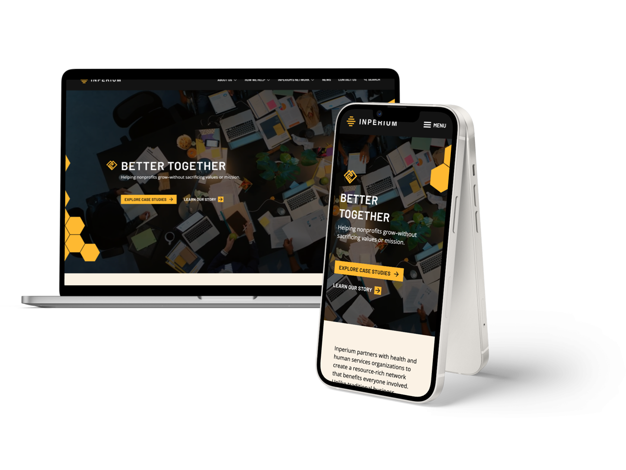
Initially considering just a simple refresh of their website, we were able to demonstrate that by making more significant improvements to their brand identity, messaging, and digital presence they would make a more significant impact and better communicate their complex service offerings.
What began as a simple redesign project evolved into a total brand identity overhaul, modern design system, and new content strategy.
Built on the foundation of collaborative support and mastery, the beginnings of the Inperium logo center around the beehive. The beehive represents innovation and ingenuity.
In the latest iteration of the logo, the logo elements have been streamlined and optimized in the interest of versatility resulting in a visual identity better aligned with Inperium’s established voice of being professional, supportive and forward-thinking.
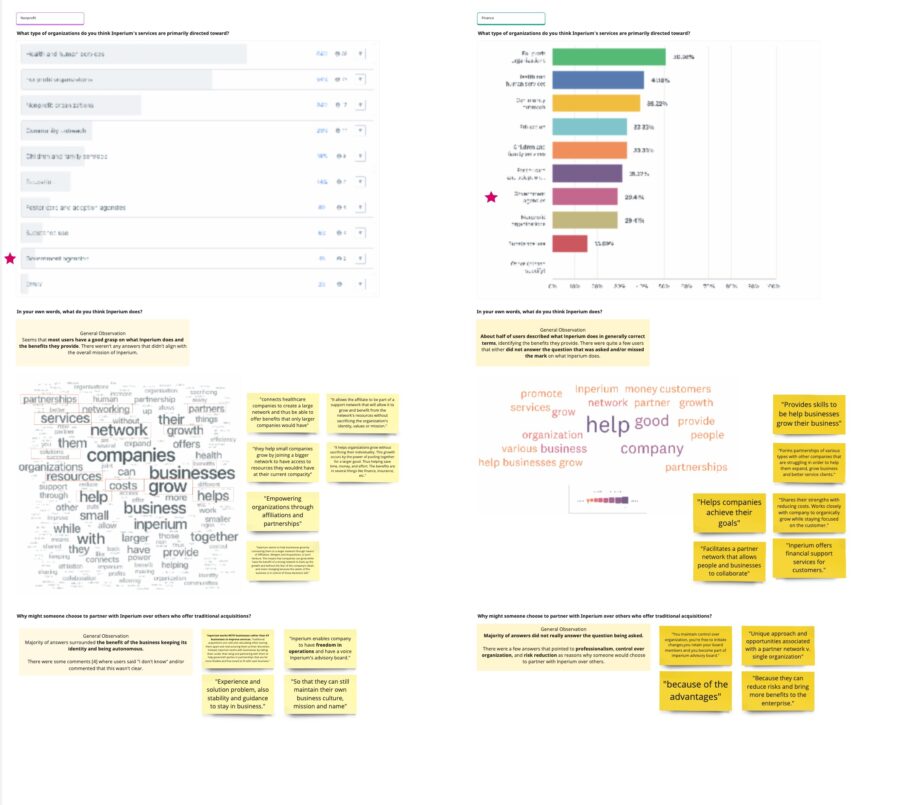
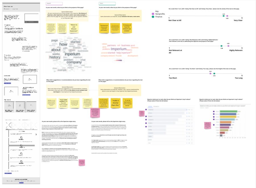
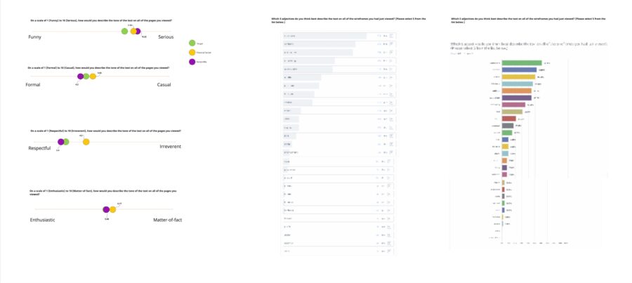
We performed extensive research and testing on the voice, tone, messaging, and copy for the new brand and experience. Our research showed that Inperium’s voice should communicate that they are pioneering, serving affiliates with unparalleled expertise and professionalism. That they value their partners and aim to foster business relationships through respect, support, and mutual collaboration.
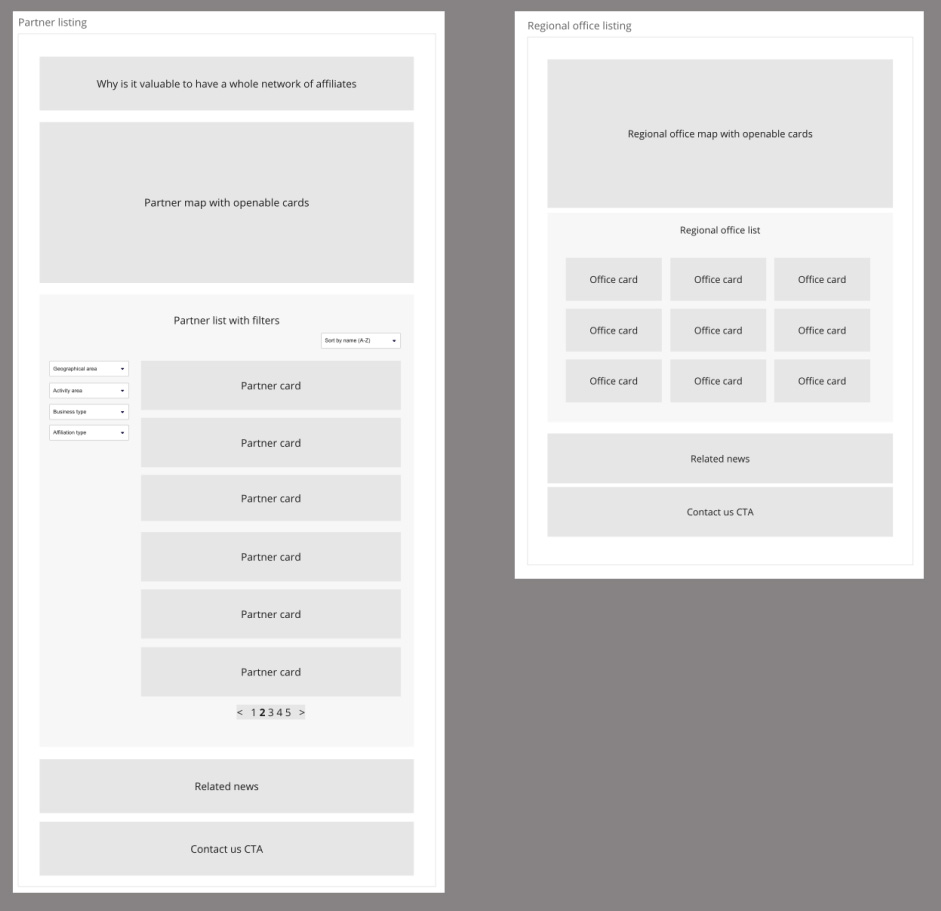
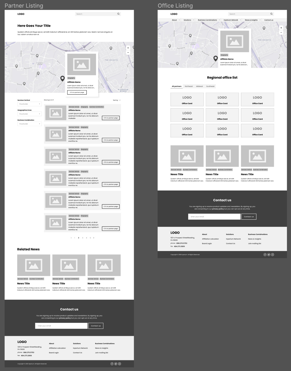
Both lo-fidelity and hi-fidelity wireframes helped us hone in on the ideal user experience. Extensive prototyping allowed us to test the new designs with users in moderated usability tests.